
TNT Bitters Co.
Logo, Identity Program, Packaging-
Founded in 2017, New York-based TNT Bitters Co. creates cocktail bitters with explosive flavor. The name and vision for the brand was largely a reaction against the over saturation of apothecary-style branding in an already pretentious space, and the desire to market bitters that were fun and approachable. The challenge was to create a light-hearted but professional and adaptable identity that would bring to light the unique personality of the brand and help it stand apart from the competition.


The old logo did not effectively communicate the desired tone of the brand, and the textured patterns within the letters posed issues with certain production methods.

The new logo is playful in nature and reminiscent of a comic book masthead. The perspective has the user looking upward at the mark to illustrate a sense of depth and a feeling of importance. The simplicity of the logo allows for ease of production and endless variation, an important trait as the brand grows, evolves, and adds products.
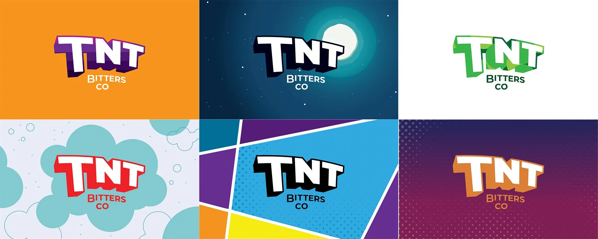
The application of the brand is bold, bright, playful, and energetic, and draws heavily from comic-style graphics. Having a certain amount of freedom within the look-and-feel allows the brand to adapt and grow as new products are developed and as new applications are needed. Strategically executing this style means that every product has its own unique graphics and color palette, but the brand as a whole remains cohesive.


